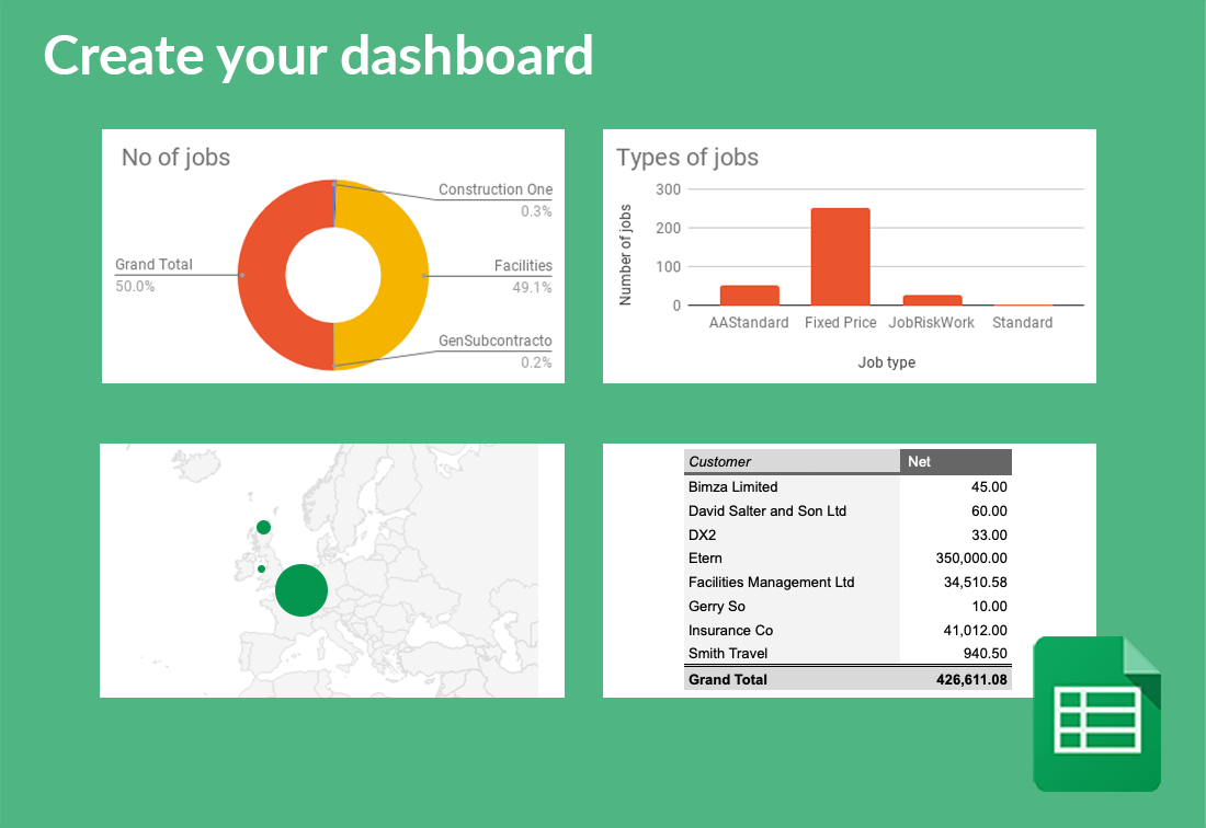
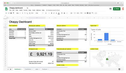
With Google Sheets and Okappy, it’s really easy to create dashboards to show metrics such as
The number and types of jobs you’ve done.
Your latest customers
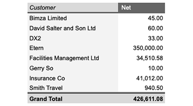
The revenue you’ve generated per customer
How many jobs and what types of jobs have been done for different customers
Average job value
Location of jobs
Revenue per month and how its grown
When customers are located
And many many more
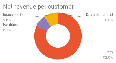
Step by step guide to showing your revenue per customer
To create a chart showing your revenue per customer over a period. Follow these steps:
- From within Okappy,
- Go to your Reports screen,
- Click the Invoices raised Report,
- Choose a time period and click Generate report,
- Once the report has run, click the Google Sheets icon to get the google sheets formula,
- Click Copy formula (or copy it manually)
- Create a new google sheet. You can type sheet.new in the your browsers address bar,
- Click a cell and paste the formula,
- Google Sheets will pull back the data from Okappy and display it in your spreadsheet,
- Select the cells which contain the data,
- Click Data and then Pivot table,
- Click New Sheet,
- In the Pivot table editor,
- Click Add next to rows and select Customer
- Click Add next to values and select Net and then change to Sum
- Select the Pivot table which has been created
- Click Insert and then Chart
- In this case, choose a Doughnut chart
To show all revenue up to the current date, edit the formula you posted in step 8 above by replacing the date in the toDate to the following “&text(TODAY(),“dd-mm-yyyy hh:MM”)&”
Be the first to hear
Leave your email below to stay up to date with our latest tips, tricks and trends on all things business?